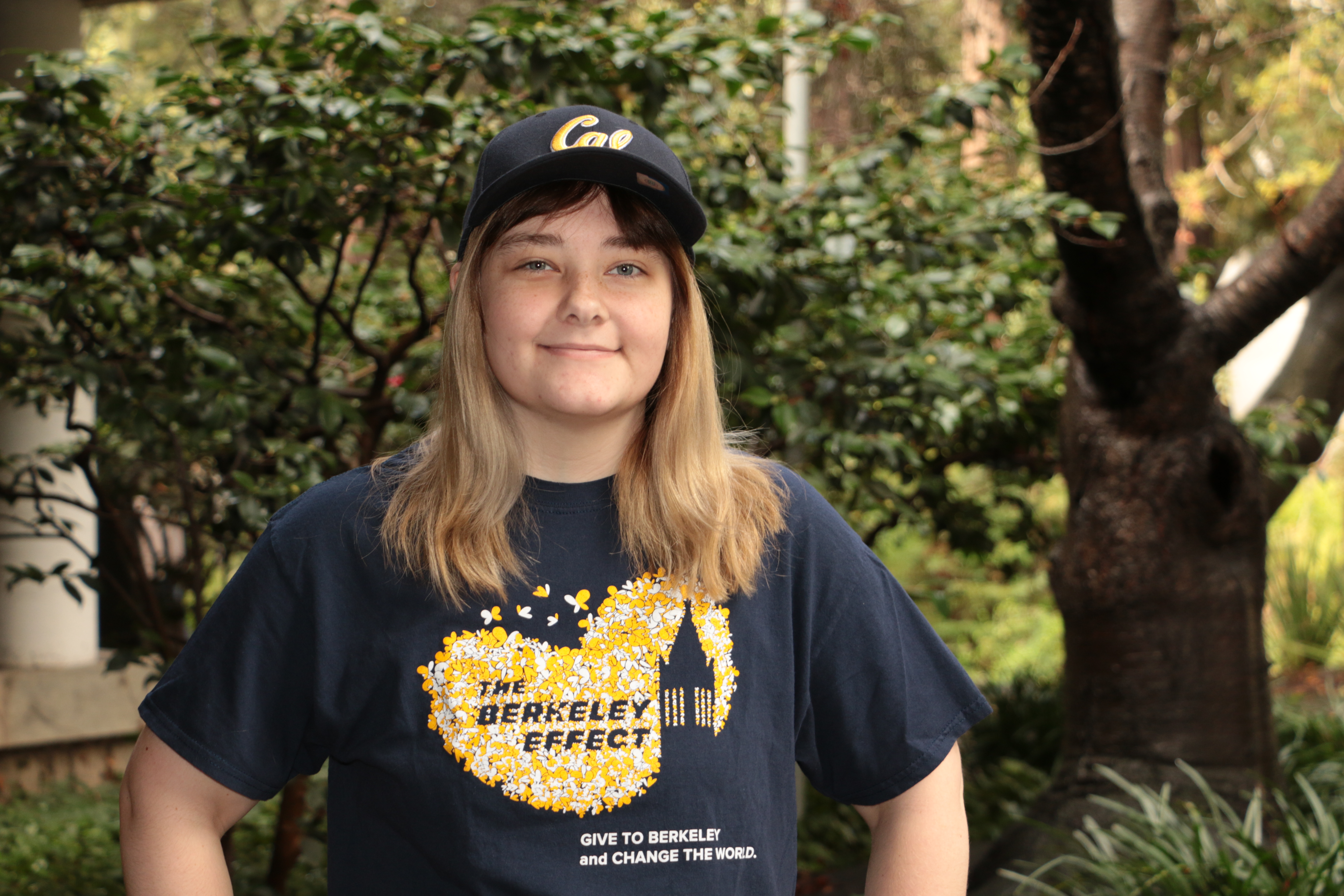
Hi, I'm Davienne.
I am a digital humanist, content creator, and lover of 80's music. This is where I'm documenting my creative endeavors, projects, and hosting some of my scholarship in digital art history.
As a digital humanist... I combine my passion for art scholarship with technology to not only to discover new and exciting things about art, but to document and preserve shared cultural heritage as well.
As a content creator... I love to make things for myself and others. In a utilitarian sense, I find the "do it yourself" approach of creating media and entertainment more rewarding than being a passive audience. Collaborative creation has always been an important part of my life.
Check out some of my projects below, or get in touch.

Imagining An Impossible Room
 The Art Gallery of Cornelis Van der Geest, 1628, by Willem van Haecht
Imagining An Impossible Room was my undergraduate senior thesis completed at the University of California, Berkeley. The subject of the thesis was the painting The Art Gallery of Cornelis van der Geest by Williem van Haecht.
An exemplary kunstkammer (art room), the painting depicts Van der Geest’s art collection along with a cast of notable Antwerp figures, foreign dignitaries, and the Archduke Albert and Archduchess Isabella. A contradiction of contrivances and truth: this painting is one of the only kunstkammers that reference actual works in an art collection, yet the guests in attendance could not have possibly all been there at the same time. The room’s height is exaggerated to include more space for the artworks in the collection yet remains faithful to the interior design trends seen in the Flemish Region during the early 17th century.
At its core, this painting is as equally genuine as it is artificed. Which makes it a fascinating subject to try and recreate in virtual space.
What I found was that the artist, Van Haecht, either at the behest of his benefactor Van der Geest, or by his own intuition, altered the dimensions of artwork depicted in the painting. This can be explained by using three different case studies from the virtual reconstruction.
The Battle of the Amazons (Peter Paul Rubens, 1615)
 The Battle of the Amazons, 1615, by Peter Paul Rubens
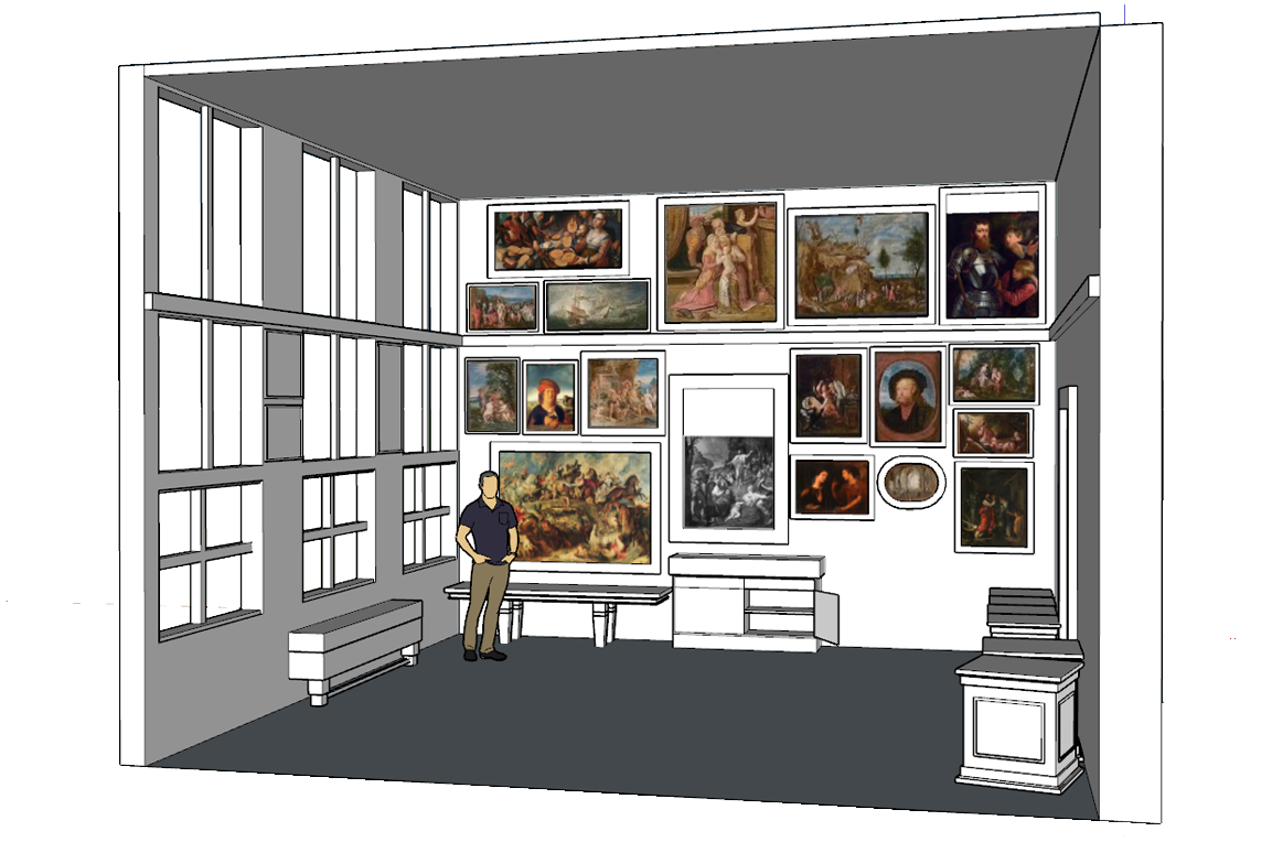
In relation to all the other artworks depicted that had extant dimensions to compare, the most accurately depicted artwork was Peter Paul Rubens’ The Battle of the Amazons (1615). This was the painting I used as a measurement standard to construct the initial room. This painting was likely depicted so accurately due to Rubens prominence as an Antwerp artist, and the desire to feature his artwork as a focal part of the collection.
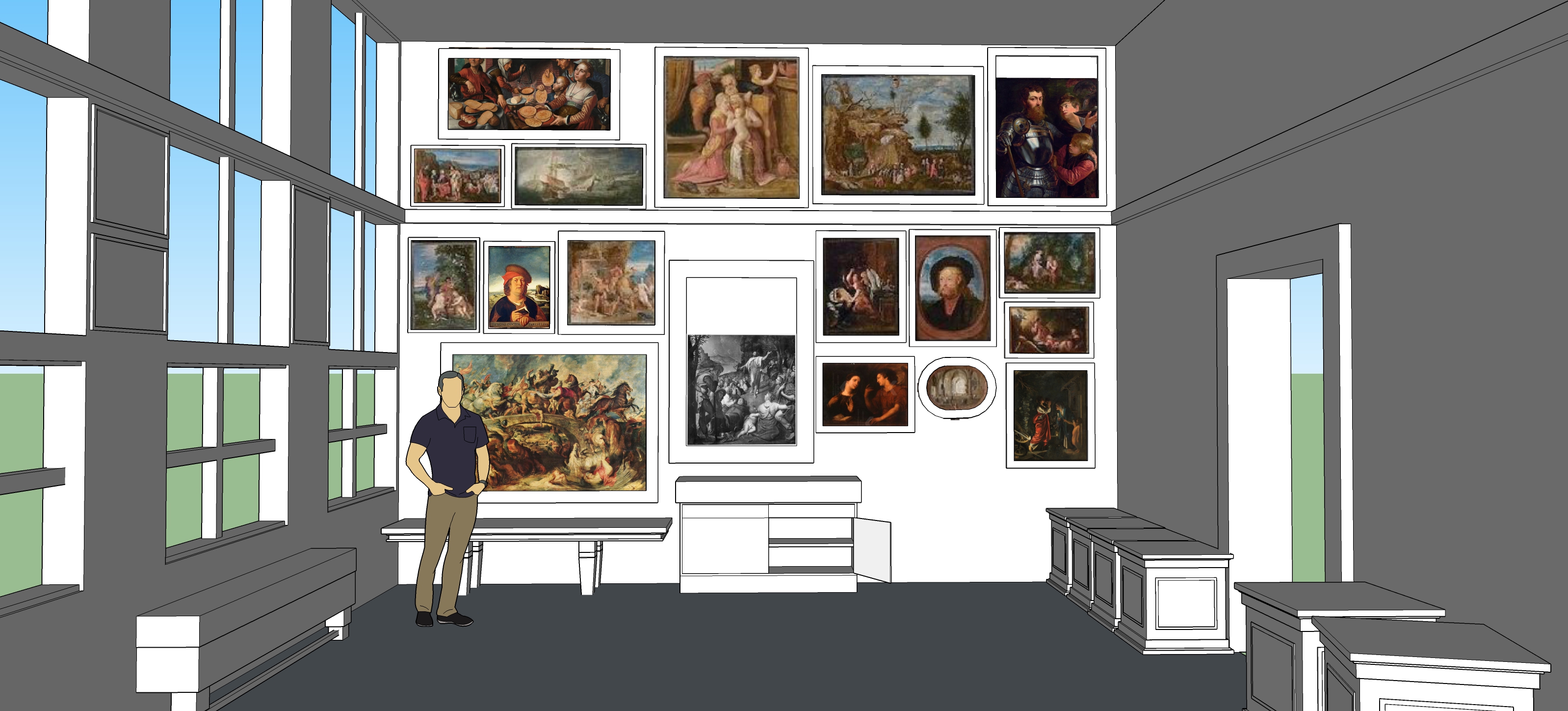 A reconstruction of the room using the "Amazon Standard"
Ceres and Stellio (Adam Elsheimer, 1605)
 Ceres and Stellio, 1605, by Adam Elsheimer
The second case study, Adam Elsheimer’s Ceres and Stellio (1605), begins to reveal a discrepancy in how certain artworks are depicted. In fact, this artwork has the largest discrepancy between the depicted and extant dimensions, with the depicted dimensions being nearly twice as large as extant painting. Why go to the trouble of making this painting so much larger? Elsheimer was known for creating smaller works, and he only created a limited number of them in his lifetime. Of course Van der Geest, a man preoccupied with status, would want viewers to know he owned a rare Elsheimer painting. To ensure this, Van Haecht depicted the painting larger than it actually was, so that the viewer could easily recognize the notable work.
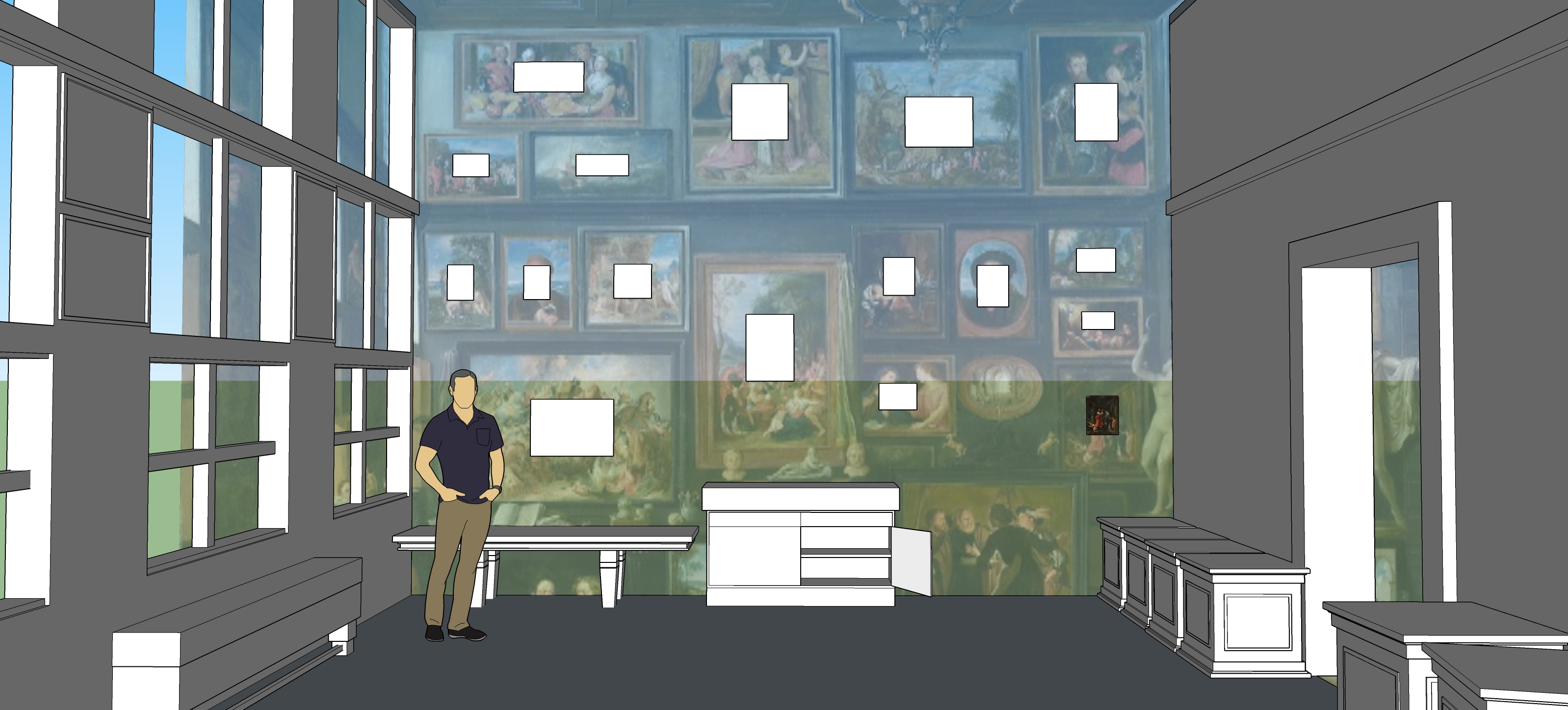 Paintings dimensions rendered using the "Ceres Standard"
The Pancake Bakery (Pieter Aertsen, 1560)
 The Pancake Bakery, 1560, by Pieter Aertsen
The final case study, Pieter Aertsen’s The Pancake Bakery, highlights an artwork that is constrained due to its non-traditional dimensions. The artwork has the largest discrepancy in measured ratios between its extant and depicted measurements. While it might have been cumbersome to find a composition in which to fit The Pancake Bakery onto the wall of art, it was important for Van Haecht and Van der Geest to do so. Aertsen, while not a native to Antwerp, lived and worked in the city for many years, and became an important figure in the city’s artistic culture.
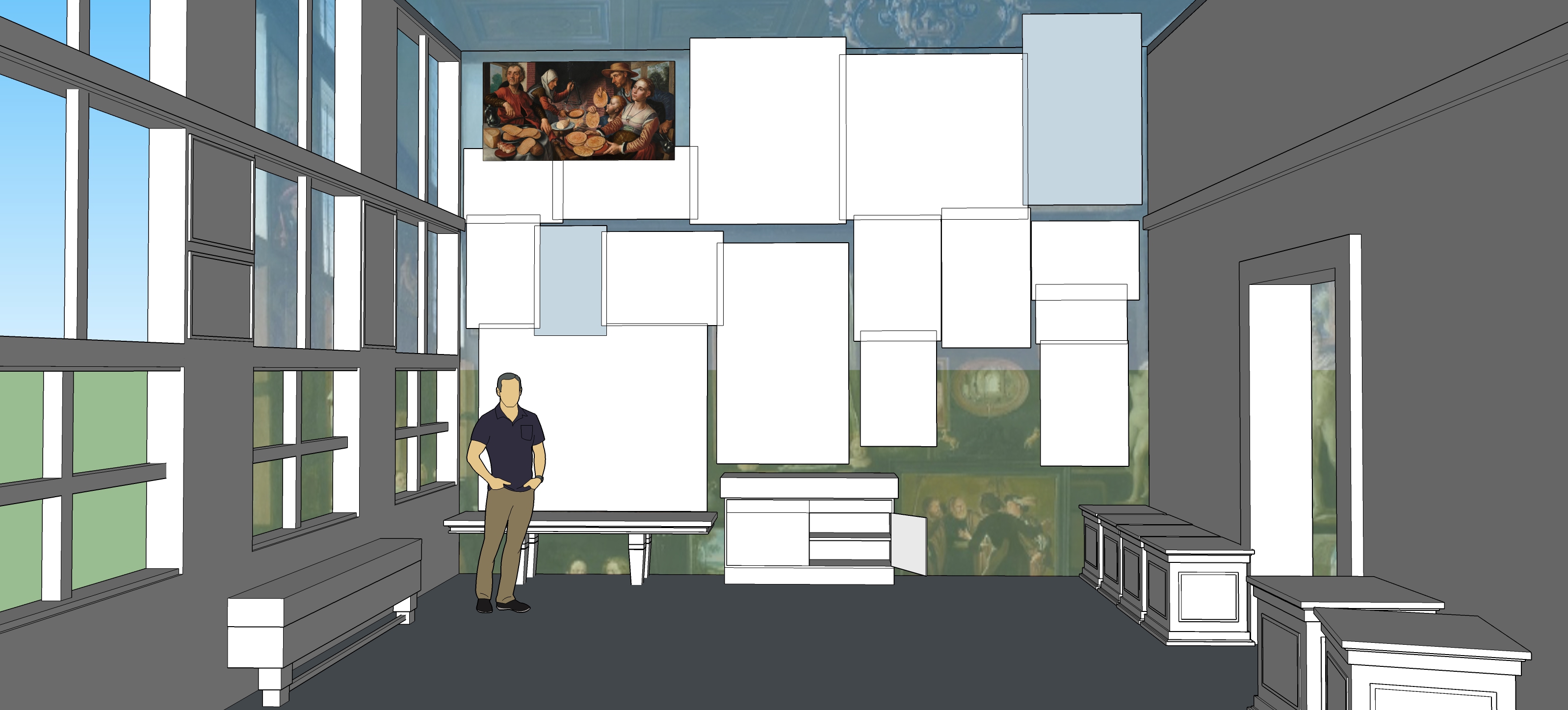 Paintings dimensions rendered using the "Pancake Standard"
Conclusion
Virtual reconstruction has shown that the artist, Van Haecht, prioritized the accuracy of some paintings over others, thus creating a canon of prestige surrounding Van der Geest and his collection. This project confirms previous assessments that the room and its contents are fabricated, with the quantitative analysis facet outlining exactly to what degree.
Data created for this project, the virtual models constructed, and the thesis itself can be found here.
Escape Room Data
Before working at an escape room, my familiarity with the phenomena was from fictionalized, comedic scenes: a zealous couple tearing the room a part in Portlandia, or an absent game room operator condeming Bob and Linda from Bob's Burgers to a room with a live rat and a double date gone wrong. Now, after having worked at multiple escape rooms and participating in many with family and friends, I can at least say that the only innacurate portrayl so far has been the live rat.
This project was to explore some of the biases I held in regards to escape rooms.
- This project was done with Python and Jupyter Notebooks utilizing Bokeh open source data visualizations. The data was cleaned using OpenRefine.
- This is real world data reflecting actual escape rooms. The location and room identifiers are being kept confidential.
- Often the scope escape rooms spans more than one chamber. All three of these escape rooms are comprised of two chambers total.
Escape Rate by Days of the Week

View this graph in a separate window
Are groups more likely to get out on a weekend rather than a weekday? The data would point to: yes, consistently for all 3 rooms groups are more likely to get out on weekends rather than week days. Also, groups that don't get out are much more likely to use all three of their hints, no matter what day of the week it is.
Number of People in Group by 2nd Room Entry Time and Escape Status
View this graph in a separate window
This graph is interactive, in that you can click on the legend and view the points by whether they escaped or not. While a very dense graph, it reveals a few interesting trends. Across all three escape rooms, groups that have more players tend to get into the 2nd room quicker than those with less. The time the group got into the 2nd room is often a good indicator of whether or not the group will escape, as many of the groups that do escape reach the 2nd room within a critical threshold.
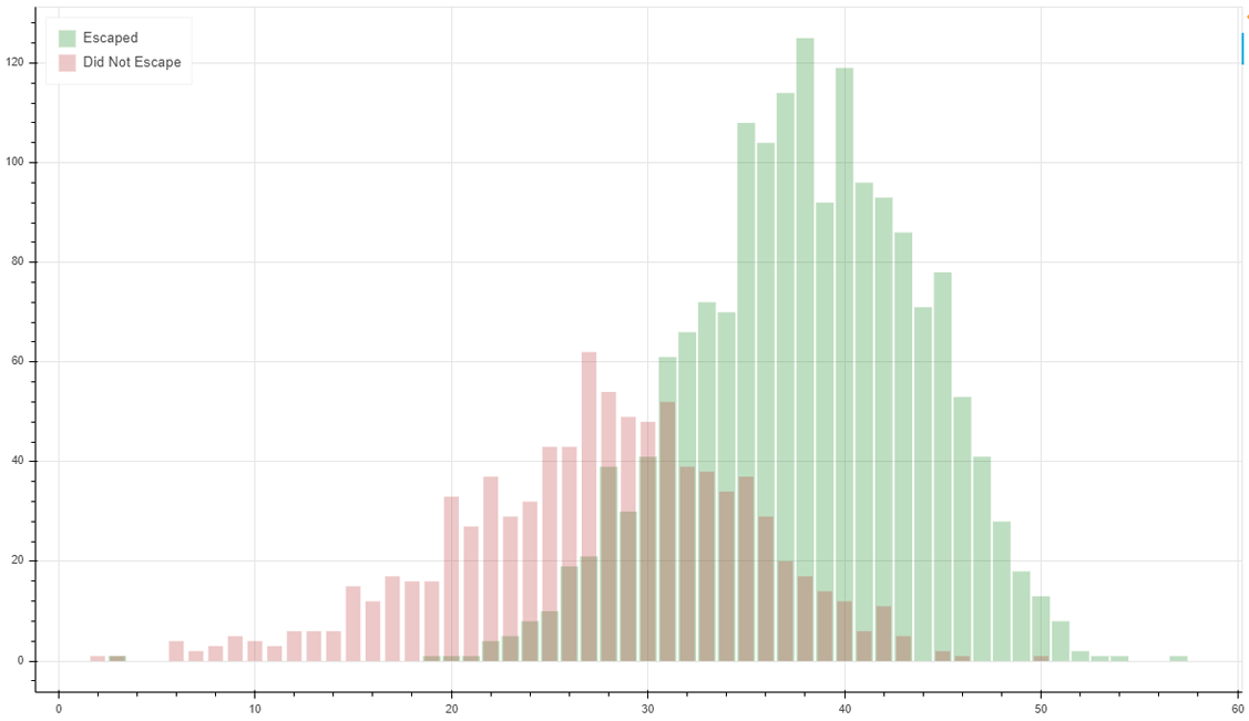
2nd Room Entry Times by Escape Status
View this graph in a separate window
Another view of the data based on what time the group got into the 2nd room. This graph more clearly shows the importance of having enough time to solve all of the puzzles.
Simulacra
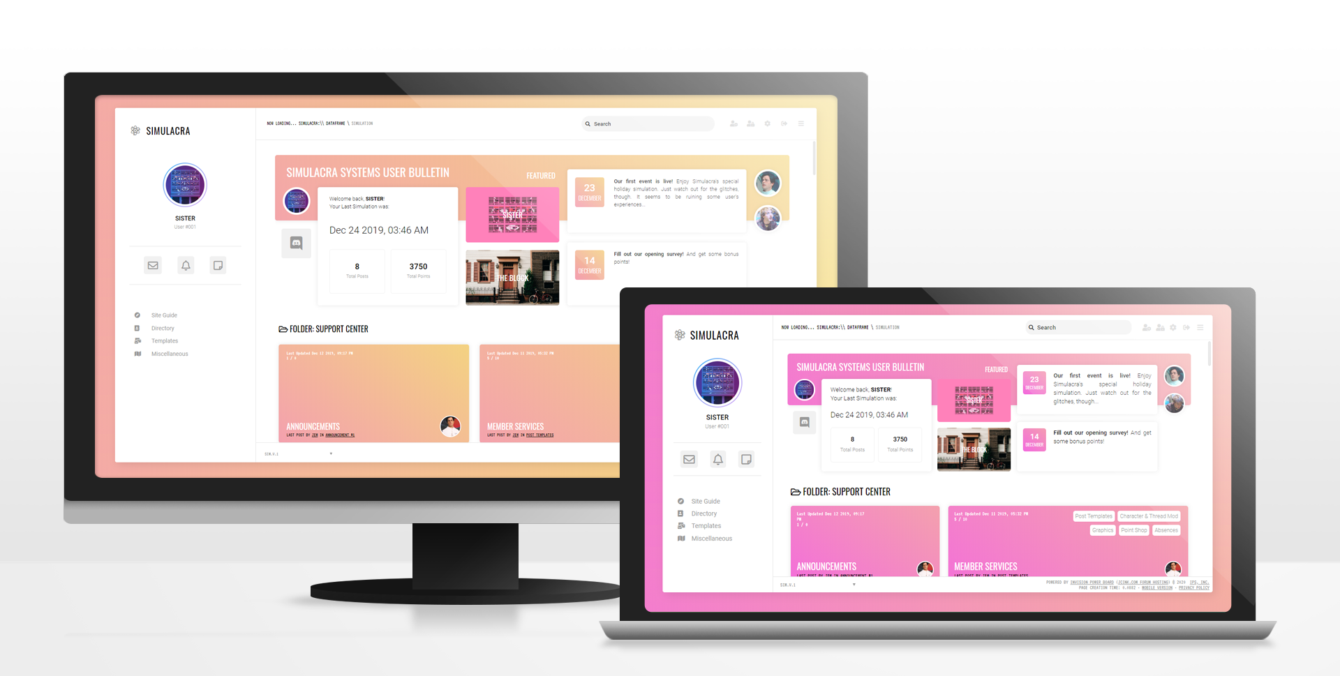
Simulacra was a project I completed in late 2019 for a collaborative forum writing community. Depending on the themes and settings in these writing communities, a "skin" will be made in order to communicate tone and establish an immersive atmosphere. Simulacra's "skin" was inspired by clean, minimalist social media web design as a way to emulate a near-future, fictional social media company.
Along with crafting the social media feeling for this design, I prioritized making it responsive and accessible.
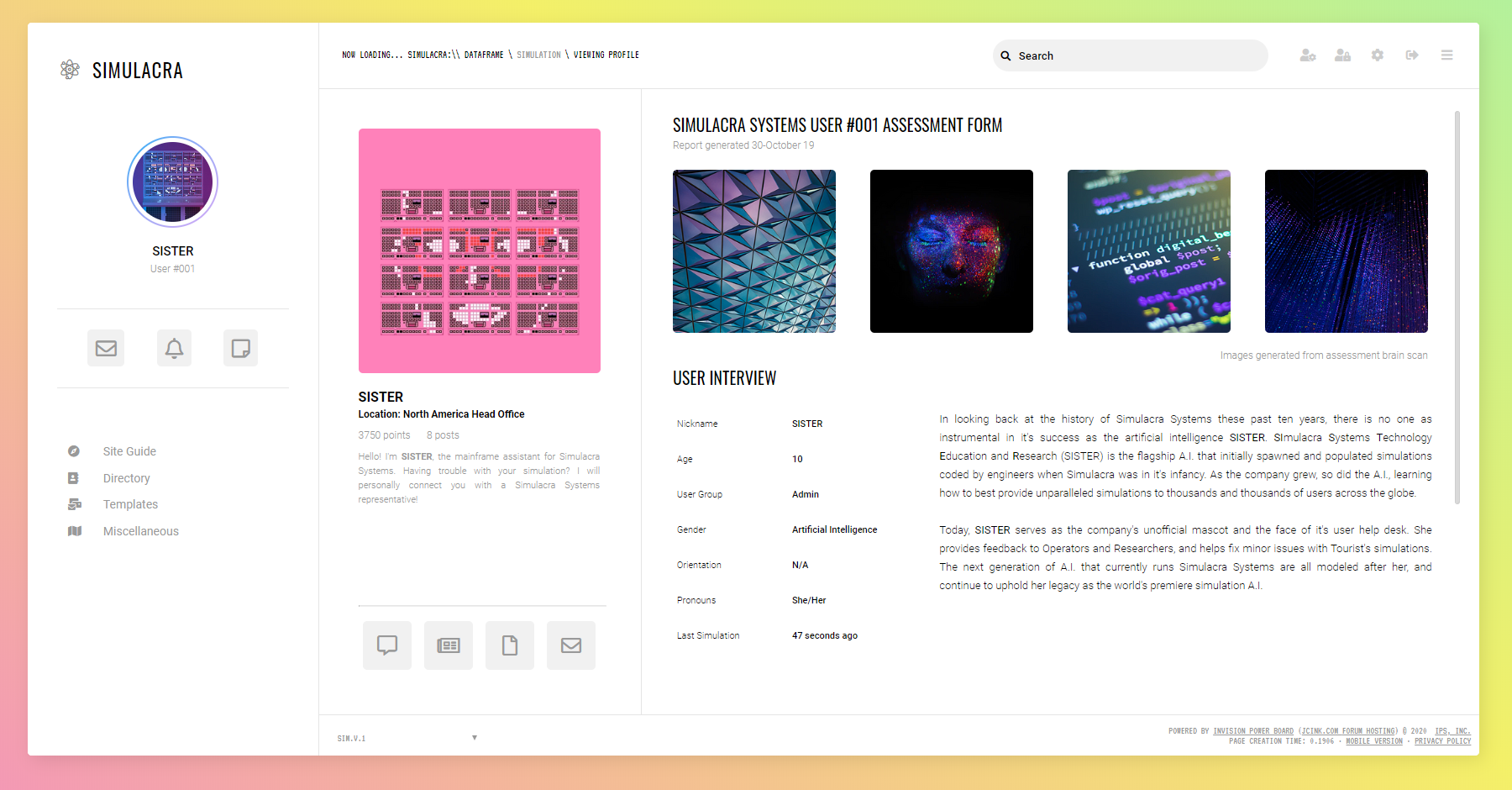
A view of the main profile for the users.
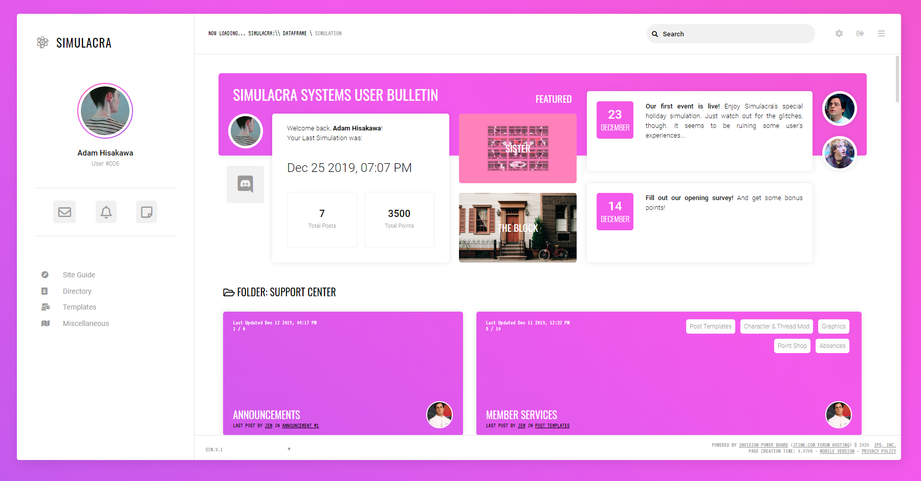
A view of the homepage. The color scheme of the website would change depending on the user's classification.
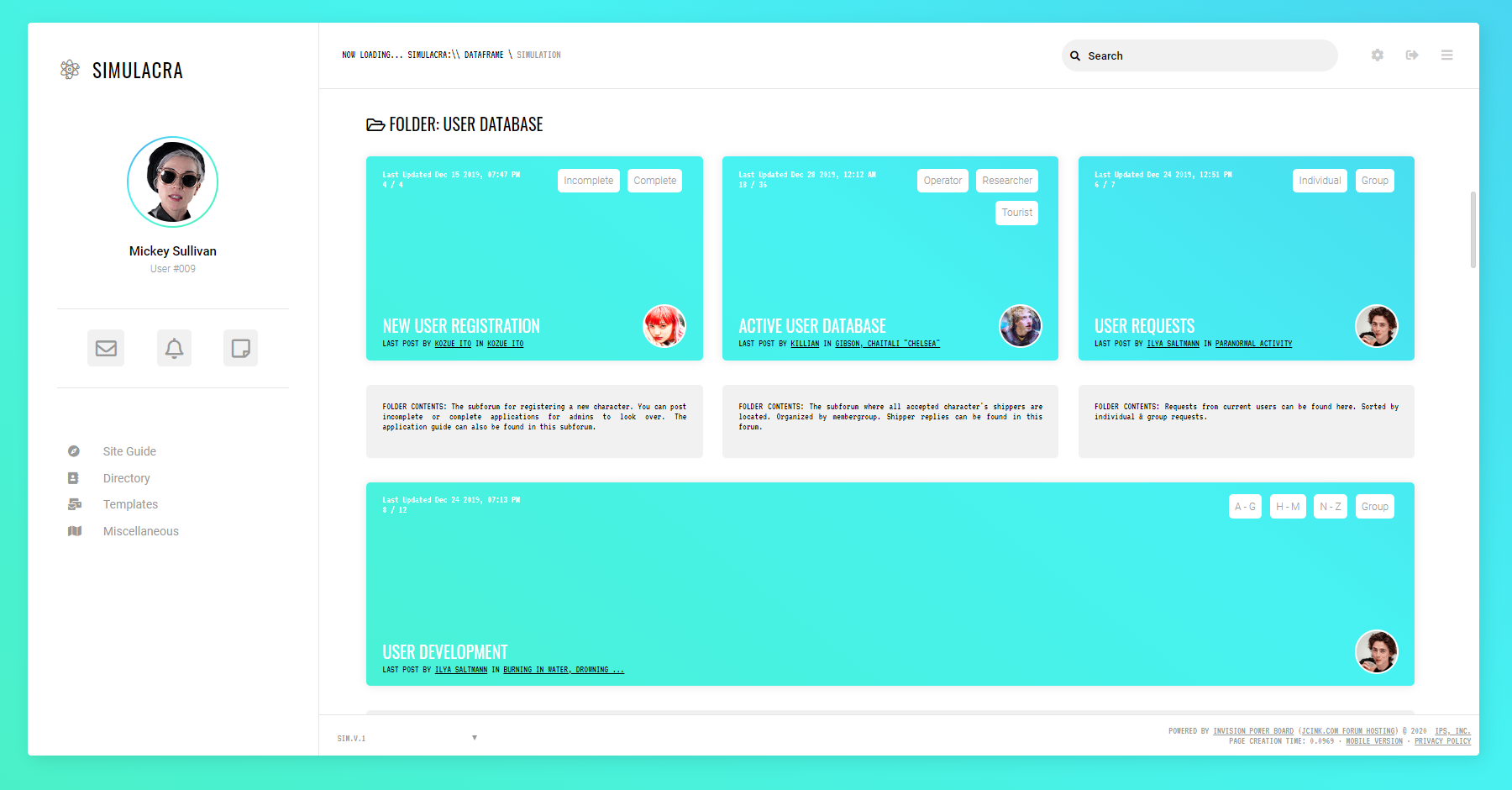
A view of the forum index further illustrating the color scheme based on user classification.
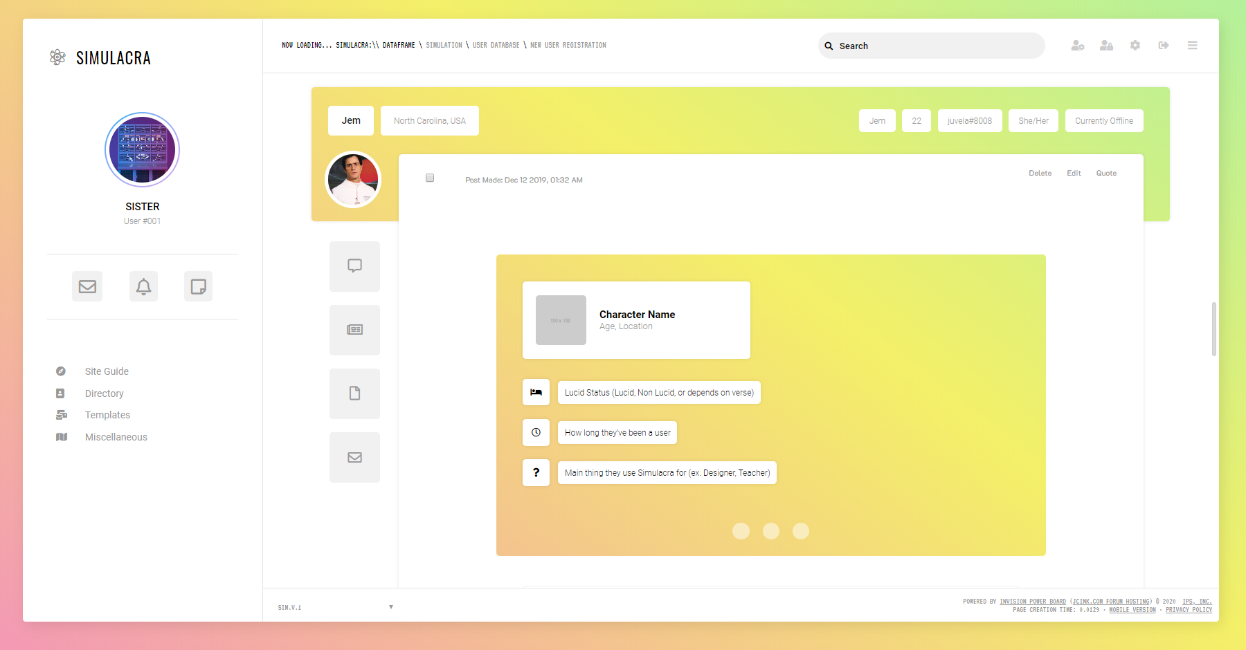
A view of a user's post within a thread.
CV & Contact
Davienne S. Gabriel
davienne "at" berkeley dot edu
Education
Experience
- Main responsibilities include providing clerical support to the Registration department through data entry, documentation, and exhibition installation and management
- Provides support on constructing foundational best practices for the conservation, documentation, and implementation of time based media works in the museum's collection
- Trained to facilitate all aspects of running an escape room for guests, including preparation, mid-game problem solving, and team debriefs
- Performs administrative functions including booking games, processing payments, and fielding phone calls
- Provided peer-to-peer consultation to design, develop, and implement undergrad digital humanities research projects through the UC Berkeley Library Digital Humanities Fellowship
- Worked independently and with a team to assemble, format, and edit photo and text content for over 40 heritage sites hosted through the Google Arts and Culture platform
- Created promotional video content for the digital documentation of world heritage sites (60 Seconds on Site, Armenia)
- Used geospatial tools like ArcGIS and Google Maps to create educational content
- Performed a variety of tasks for four semesters, including data entry, research, and mapping for the Jan Brueghel Family Site
- Learned digital art history practices and methods by working with world-renowned faculty
- Helped to maintain the website, which was hosted on the Drupal platform
- Collaborated with a team of faculty members in the D-Lab at UC Berkeley to create visual content for an online digital humanities course
- Co-founded the Berkeley Undergraduate Digital Humanities Association under the guidance of mentors at the D-Lab, acted as president and liasion between undergraduates and faculty
- Solicited donations for student enrichment from University of California Berkeley alumni and surrounding community through telephone calls
- Learned on the job sales techniques and applied interpersonal communication skills to raise funds
- Held a direct attendee interaction role in a variety of different areas in the largest computer graphics conference in the world
- Provided demonstration support to multiple vendors and exhibits, which involved technical knowledge as well as interpersonal communication skills
Skills
- Self-taught and formally trained
- Proficient in digital artwork as well as trained in traditional media
- Self-taught and formally trained
- Utilized in creative projects of varying media types (images, animations, videos)
- Self-taught and formally trained
- Proficient in basic HTML, CSS and Javascript
- Formally trained through UCB and semester coursework
- Utilized through several different project types, including text analysis through natural language processing, data science coursework, and data visualization exercises